Here is the next installment of ‘Seen in this weeks GNOME release’. Todays screenshot gallery is a little more extensive than last weeks. We’re rapidly completing our feature list. Most of the items on that list are now marked as ‘Complete’ or ‘Almost complete’. Good timing, since we are entering the freeze with the 3.5.90 release, and can now focus on polishing these features and fixing the remaining bugs.
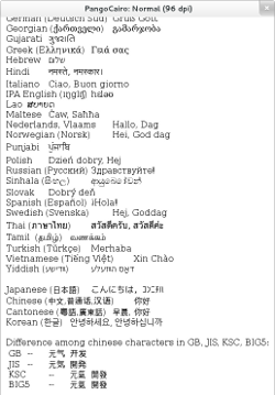 The first feature to show this week is one that I’ve wanted to see for a long time: the harfbuzz 1.0 release is right around the corner, and harfbuzz support has been merged in pango. Behdad has been working on this OpenType implementation since 2006, and pango has been using an embedded copy of an early harfbuzz snapshot for a while.
After a long period of stasis, we will finally see new life in our text rendering stack. The screenshot I’m showing for this looks just the same as it always has, since all the harfbuzz goodness is still under the hood.
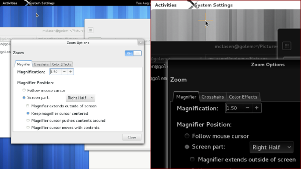
We’ve had a magnifier integrated in gnome-shell for a few releases now. Since 3.4, it was configurable from the universal access panel. In this release, it will be possible to configure various color effects on top of the zoom, such as inverted colors, desaturation and contrast changes. As you can see in the screenshot, we’ve reorganized the zoom options into tabs, and added a tab for the color effects.
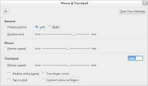 Still in the control-center, we have a redesigned Mouse & Touchpad panel, which was implemented by our Red Hat desktop team intern in Brno, Ondrej Holy. Amongst other things, you might spot the option for ‘natural scrolling’ in here.
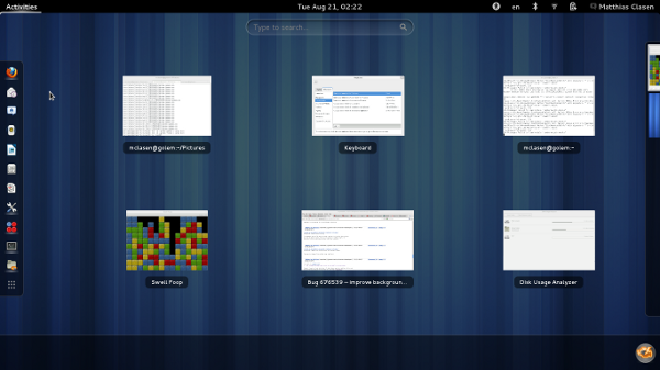
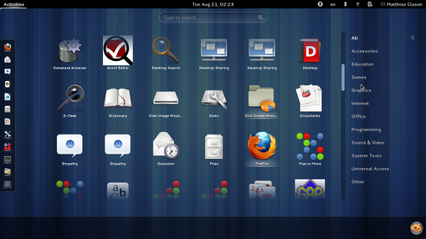
Over in the shell, there’s a new ‘mode-less’ overview. As you’ll notice, the search entry is bigger and centered, and the tabs are gone. To switch from the window view to the application grid, you can use the ‘nine dots’ button that can be seen at the end of the dash.
The new overview is the work of Florians summer of code student, Joost Verdorn, who has written more extensively about it already.
At the bottom of the overview, the new message tray is visible.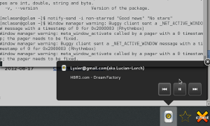 It received a major redesign to address the problems that people have had with the original 3.0-era tray design.
Beyond the new visuals (bigger icons, no labels, close buttons), there are many subtle behaviour changes here that are hard to explain unless you try it yourself. One notable change is that the message tray is not raised ‘by itself’ anymore, you always have to bring it up explicitly. One way to do that is to use the new Super-M keybinding. Keyboard navigation is generally improved: you can focus individual icons and actions.
Many people have contributed to the message tray redesign, around the core work done as a summer of code project by Ana Risteska.
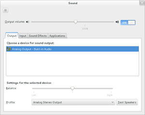
 Back in the control-center, the sound panel has gotten its Hardware tab removed. Instead, the device lists now offer more fine-grained choices.
This simplification has been implemented by Canonical. It was made possible by earlier pulseaudio work by David Henningsen that has landed upstream in pulseaudio 2.0.
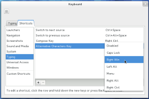
In the keyboard shortcuts section, some useful pieces of XKB layout configuration have reemerged. The frequently used compose key and ‘third level chooser’ variants can be set like other keyboard shortcuts now.
When it comes to appearance, GTK+ 2 applications will look less out of place in GNOME 3.6, thanks to a much improved gtk2 version of Adwaita. This theme was originally developed under the name ‘Bridge’ by Jack Gandy.
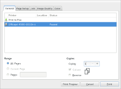
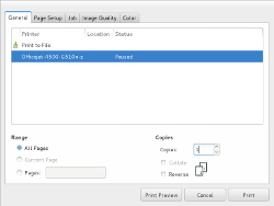
You have to look closely to see the differences between the GTK+ 2 and GTK+ 3 print dialog in these screenshots.
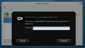
The last thing I have managed to capture in screenshots is the support for secondary Kerberos logins that has been integrated in gnome-online-accounts. The functionality is seamlessly integrated with the traditional krb5 commandline tools: if you run kinit in a terminal, the ticket will immediately show up the online-accounts panel, and you will get notifications before it expires.
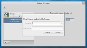
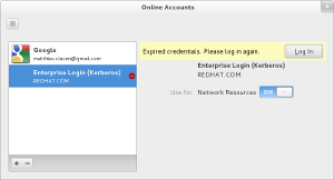
 This functionality was originally planned to land in the user panel, but the online-accounts panel seems a much better fit.
